
Quick overview
How to select and move something in Procreate
Tap Selection, choose Automatic or Freehand, isolate the part you want to edit, then tap Transform to move, resize, rotate, distort, or warp it. If you want to move the entire active layer, skip Selection and open Transform directly.
Troubleshooting / Blurry artwork
Resizing made your artwork blurry? Start here
Work from the original pixels before trying another resize. Procreate uses raster pixels: no interpolation setting guarantees lossless resizing or restores missing detail in an enlarged image.
-
Undo the blurry resize
Return to the original pixels. Duplicate the original layer before a major edit so you keep a clean starting point.
-
Choose interpolation for the artwork
In Transform, tap Nearest, Bilinear, or Bicubic. Try Bicubic for smoother results, compare Bilinear, and use Nearest Neighbor when hard pixel-art edges matter.
-
Commit once, then check
Finish the scale and rotation in one Transform session when possible. Inspect the result at its intended viewing size before continuing.
1. Choose Automatic, Freehand, Rectangle, or Ellipse
Selection decides which pixels can change. Transform moves or reshapes them, so most useful edits go straight from one tool into the other. The details below matter when the selection edge is difficult, the edit needs perspective or warping, or resized artwork starts looking blurry.
Freehand is the everyday choice for irregular drawing edits. I use it for things like moving a facial feature, changing the angle of an arm, or isolating a loose shape that does not have a clean color boundary. You can lift the pencil, pan or zoom, and continue the selection. Tapping points instead of drawing creates straight segments.
Automatic is faster when Procreate can identify a connected area from color or transparency. Rectangle and Ellipse are useful when the selection itself should be geometric, or when you simply need a fast boundary around a larger part of the drawing.
The boundary only needs to protect the pixels that should stay still. A practical selection that takes ten seconds is often more useful than a perfect trace that takes longer than the edit.

2. Refine the selection before you transform
Use Add and Remove to build a difficult selection in pieces. This is faster than starting over when hair, hands, sketch lines, or nearby colors make one clean pass unlikely.
With Automatic selection, drag left or right to change the threshold. A low threshold can leave pixels behind. A high threshold can spill into neighboring colors. Automatic selection works through connected areas, so an outline or gap can keep it from reaching a separate patch of the same color.
Invert helps when the background is easier to select than the subject. Save and Load stores a selection inside the current artwork when you know you will need the same boundary again. Copy and Paste or the three-finger Cut and Paste menu can move the selected pixels onto their own layer before a larger edit.
Use Feather carefully. A small amount can soften the one edge that needs to reconnect, but feathering the entire boundary can soften details that were already clean.

3. Move the selected part with Transform
When the selection is active, tap the arrow to open Transform. Drag inside the bounding box to move the selected pixels. Use the handles to resize, rotate, or reshape them. Tap the arrow again to commit the change.
If you open Transform without making a selection first, Procreate transforms the contents of the active layer. That is the correct shortcut when the whole layer should move. Make a selection only when part of the layer needs to move independently.
Before a major edit, duplicate the layer or copy the selected element to a new layer. You can compare the result without losing the clean original, and reconnecting lines is easier when the moved piece is still separate.

Quick reference
Which setting should you use?
Start with the least aggressive tool that completes the edit. It usually creates less cleanup.
- Irregular shape
- Use Freehand selection and refine it with Add or Remove.
- Connected color area
- Use Automatic selection and drag to set the threshold.
- Move or proportional resize
- Use Uniform so the artwork keeps its width-to-height relationship.
- Squash or stretch
- Use Freeform when changing width and height independently is intentional.
- Perspective change
- Use Distort to pull individual corners.
- Local bend or reshape
- Use Warp or Advanced Mesh and expect to check the connecting edges.
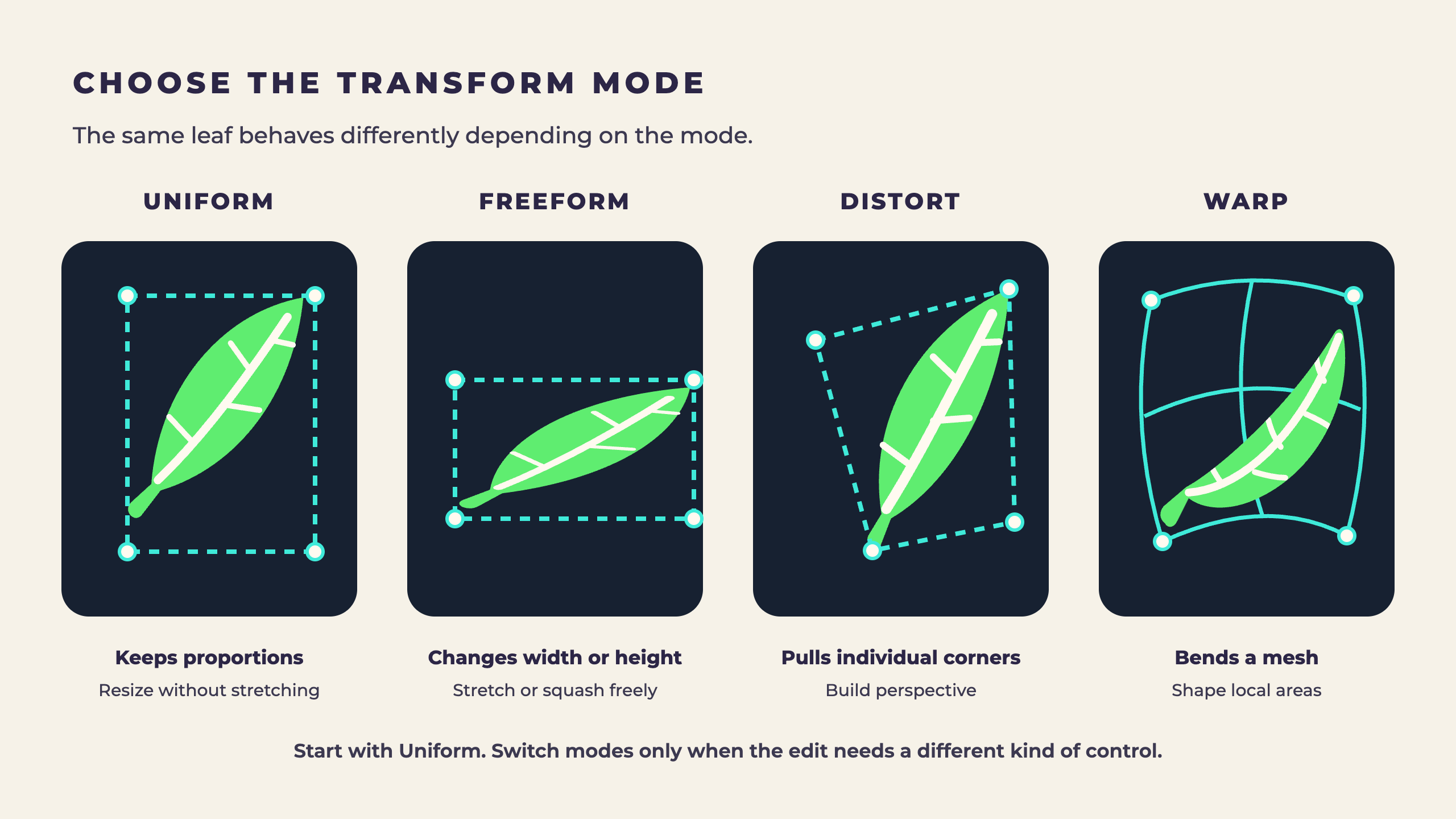
4. Compare Uniform, Freeform, Distort, and Warp
Uniform keeps the artwork proportional while you scale it. It is the safest starting point for moving a feature, resizing a prop, or adjusting a composition without accidentally stretching the drawing.
Freeform changes width and height independently. It is useful when squash or stretch is part of the design, but it can also distort a character quickly if you meant to preserve the original proportions.
Distort lets you pull the corners separately. Use it for perspective-like edits, such as fitting artwork onto an angled surface.
Warp bends the artwork through a mesh, and Advanced Mesh gives you more local control. It works well for changing a curve or pose when a simple corner adjustment is not enough.
Every mode is still transforming raster pixels. A dramatic change may need a few lines redrawn where the selected piece reconnects to the rest of the illustration.
5. Use Snapping and Magnetics for alignment
Turn on Snapping when the moved artwork should line up with the canvas or another element. Procreate shows guides as the selection approaches an alignment point. This is especially helpful when an object looks centered but is actually one or two pixels off the canvas edge.
Magnetics keeps movement on a consistent axis. It is separate from Snapping, so use it when you want a straight movement path rather than alignment to another object.
Distance and Velocity belong to Snapping. Reduce Distance if objects snap from too far away. Adjust Velocity if guides engage too easily or are hard to trigger. These controls do not improve interpolation, but they can keep you from nudging and transforming the same element several times.
The Transform toolbar also includes Flip Horizontal, Flip Vertical, Rotate 45 degrees, and Fit to Canvas. Use those commands when they describe the edit exactly. They are quicker and more repeatable than trying to eyeball the same result with the handles.
6. Choose interpolation based on the artwork
Procreate is a raster drawing app. When artwork is resized, rotated, distorted, or warped, the pixels have to be sampled into new positions. Interpolation is the method Procreate uses to calculate those new pixels.
Bilinear is my practical default for line work. It balances smoother edges with enough definition for most illustration transforms. Bicubic examines a larger group of surrounding pixels and produces the smoothest transitions, which often suits painted shading or photo-like detail. Nearest Neighbor uses the closest pixel value and keeps hard block edges, which can suit pixel art but look jagged on lower-resolution illustration.
There is no setting that guarantees a perfect result for every image. Compare the edge at the final display size. Canvas resolution, the amount of scaling, and the kind of artwork can matter more than the name of the method.
For the official explanation of these methods, see Procreate’s Interpolation handbook.


7. Avoid repeated transforms when edge quality matters
Every committed resize or rotation resamples the raster artwork. Transforming the same pixels again can compound the softness. When possible, finish the move, scale, and rotation in one Transform session instead of committing several small guesses.
If the first result is wrong, undo it before trying again. Procreate can restore the original pixels when you undo the transform, but it cannot reconstruct detail after you commit, continue drawing, and repeatedly transform the softened version.
A larger working canvas gives the transform more pixel information to work with, but it does not make raster artwork resolution independent. Duplicate the original before a major edit, make one intentional transform, and inspect the edge immediately.
For more on resampling and quality loss, see Procreate’s Transform and image quality reference.
8. Keep likely edits on separate layers
Selection and Transform are easier to use when the parts you expect to revise remain editable. Separate line, color, and shading layers often give you enough flexibility without turning the file into hundreds of layers.
If an arm, face, or prop may move, keeping it separate prevents background pixels from traveling with the selection. When the artwork is already flattened, make the selection close to the edge that needs to move, copy it to a new layer, and plan to redraw the small connecting area.
That is usually faster than redrawing the whole feature. The transform establishes the new position or proportion, and a short cleanup pass makes the edit feel intentional.
Before you commit
Selection and Transform checklist
- Protect the original
- Duplicate the layer or copy the selected element before a major change.
- Refine first
- Use Add, Remove, threshold, or a small Feather before opening Transform.
- Choose the mode
- Start with Uniform, then switch only if the edit needs stretching, perspective, or warping.
- Align once
- Use Snapping or Magnetics instead of committing several small nudges.
- Transform once
- Finish the scale and rotation in one session when possible.
- Check the edge
- Inspect the final-size result immediately so you can undo before continuing.
Keep learning Procreate
Continue with the broader beginner guide, speed up everyday drawing with the gesture guide and cheat sheet, or use Animation Assist to start working frame by frame.
 Video + Guide
How to Use Procreate: A Beginner’s Guide
Start drawing in Procreate with a guide to canvas setup, brushes, layers, selections, masks, and gestures, then choose what to practice next.
Video + Guide
How to Use Procreate: A Beginner’s Guide
Start drawing in Procreate with a guide to canvas setup, brushes, layers, selections, masks, and gestures, then choose what to practice next.
 Video + Guide
Procreate Touch Shortcuts and Gestures: Cheat Sheet
Learn Procreate touch shortcuts for undo, redo, layers, Alpha Lock, and QuickShape, with an illustrated gesture cheat sheet to keep nearby.
Video + Guide
Procreate Touch Shortcuts and Gestures: Cheat Sheet
Learn Procreate touch shortcuts for undo, redo, layers, Alpha Lock, and QuickShape, with an illustrated gesture cheat sheet to keep nearby.
 Video + Guide
How to Animate in Procreate with Animation Assist
Make a frame-by-frame animation in Procreate with Animation Assist. Set up frames, onion skins, holds, playback, and GIF or video exports.
Video + Guide
How to Animate in Procreate with Animation Assist
Make a frame-by-frame animation in Procreate with Animation Assist. Set up frames, onion skins, holds, playback, and GIF or video exports.
Procreate Selection and Transform questions
01How do I select and move something in Procreate?
Tap Selection, choose Automatic or Freehand, isolate the artwork, then tap Transform. Drag inside the bounding box to move it, or use the handles to resize and rotate it.
02Do I need to make a selection to move a whole layer?
No. Activate the layer and open Transform directly. Make a selection first only when part of the layer should move while the rest stays in place.
03What is the difference between Uniform and Freeform in Procreate?
Uniform keeps the artwork proportional while it scales. Freeform lets width and height change independently, so it can intentionally squash or stretch the artwork.
04Why does Procreate make my art blurry when I resize or rotate it?
Procreate must resample raster pixels whenever their size or angle changes. Large enlargements, a small source canvas, and repeated committed transforms can all soften the edge.
05Which Procreate interpolation setting should I use?
Bilinear is a useful default for line work, Bicubic gives the smoothest transitions for shaded or photo-like artwork, and Nearest Neighbor preserves hard pixel edges. Compare the result at its final size.
06Can Undo restore the quality after a blurry transform?
Yes, if you undo the transform before moving on. Undo returns to the earlier pixel state. It cannot restore detail after the softened version has been committed and transformed repeatedly.