
Project details
 Shopify
 Webflow
 Google Merchant Center
 Klaviyo
 Adobe Photoshop
 Adobe Lightroom
 Figma
 Google Analytics
- Ecommerce UX/UIDesigned product browsing, variant selection, quick add, and a custom slide-over cart for the apparel storefront.
- Shopify DevelopmentRebuilt the site from scratch in Liquid with reusable sections, product templates, and controls the team could manage.
- Webflow to Shopify MigrationRecreated the established Webflow design in Shopify while keeping products synced until launch.
- Ecommerce Web DesignCarried the Person Built visual system through product pages and responsive storefront layouts.
- SEO & AnalyticsSet up search foundations, Google Merchant Center, and analytics reporting for the storefront.
Building the SPC/LST Storefront
SPC/LST’s first storefront was a custom Webflow build, with Shopify managing the products through Shopyflow. Webflow gave us room to work through the site’s design and shopping experience quickly while the company was getting started. As demand grew, maintaining the front end and product catalog across two systems became harder. At Grisb.io, the studio I co-own, we rebuilt the storefront as a custom Shopify theme.
My work covered the interface and front-end build, from the first Webflow direction through the Shopify theme. SPC/LST’s Person Built idea gave us a useful test for every decision: does this help someone understand the gear and move through the store, and does it still sound and look like SPC/LST? We kept the layout spare, but left room for the photography, motion, and product details that give the brand its character.
Carrying the Brand into Shopify
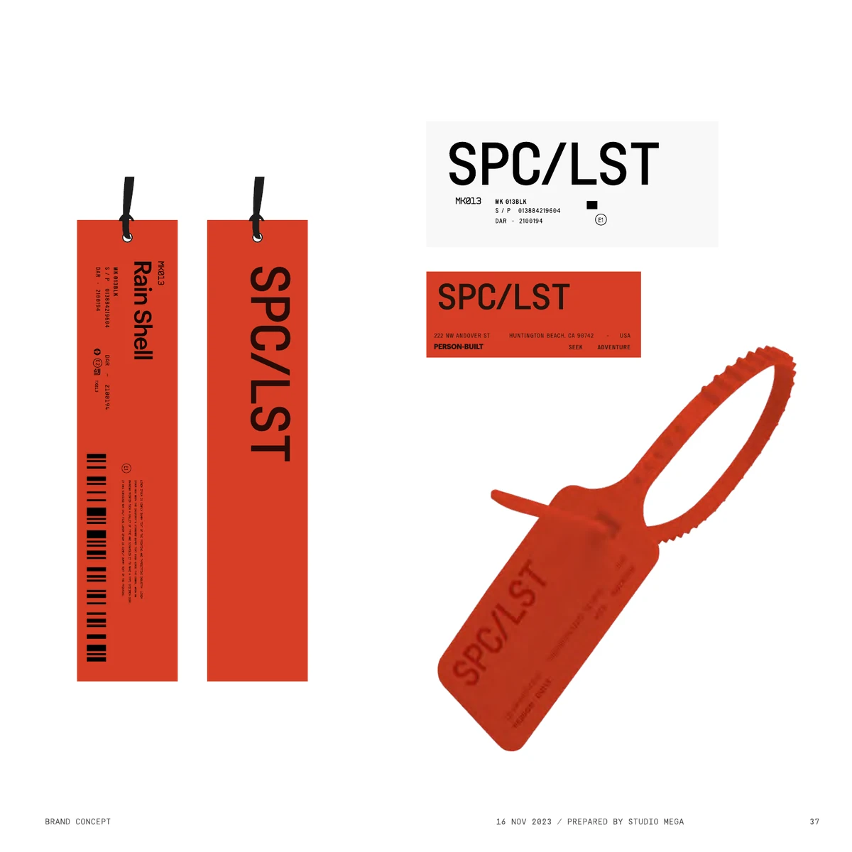
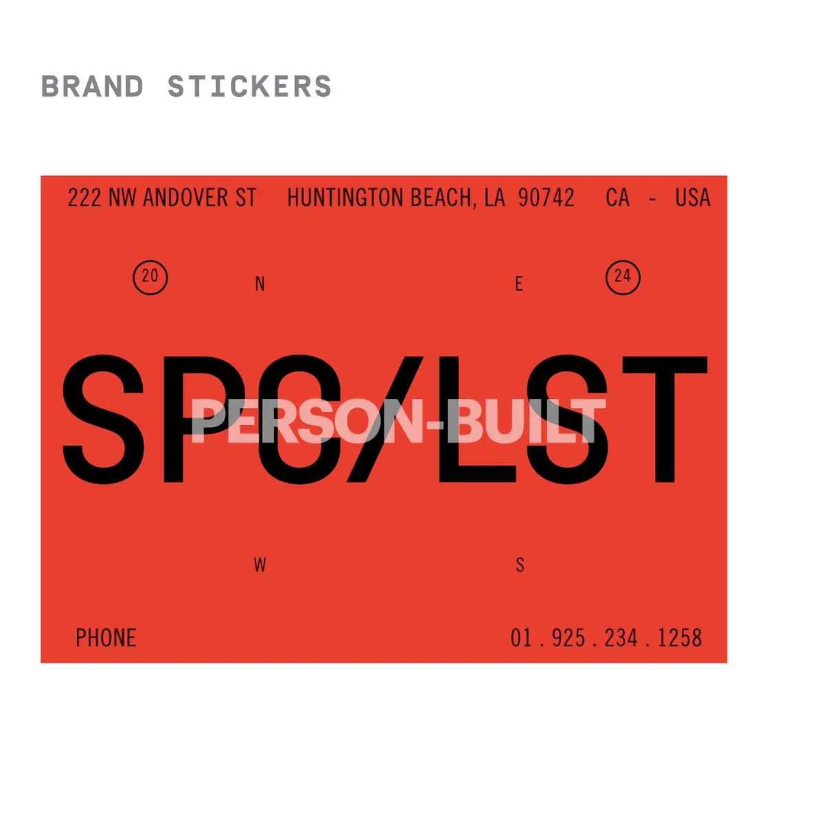
The SPC/LST brand catalog set the visual language: bold type, red and black accents, technical labels, and photography that puts the gear in use. We used it throughout the original Webflow build. Shopify held the products behind it, connected through Shopyflow. At that stage, Webflow’s flexibility let us test layouts and interactions quickly as the site took shape.
That setup worked for a while, but SPC/LST eventually outgrew it. By then, the site’s visual language and shopping patterns were established, so we needed Webflow’s quick iteration less than we needed one place to run the store. We wrote a new Shopify theme from scratch in Liquid, rebuilding the Webflow site’s layouts, interactions, type, image treatment, and graphic details. Products stayed in sync while we finished the new build, so the existing storefront could keep running until we were ready to switch.
Once the Shopify version was ready, we could retire the bridge and manage the storefront and catalog together. We checked the shopping paths as well as the appearance: navigation, collections, product options, cart behavior, and the smaller details that are easy to miss in a migration.




A Shopify Theme Built for SPC/LST
We built the Shopify theme for the people shopping the store and the people running it. Its navigation, collection pages, product pages, custom slide-out cart, and Brand page were made for SPC/LST, with reusable Liquid sections that let us update one part without rebuilding the rest.
The updated homepage moves from its opening hero and category carousel into featured-product stories and material sections. Each part gives shoppers another way into the store, while reusable Liquid sections let us change the presentation as the brand grows.
We paid the same attention to product setup. The theme can read a product’s existing information and show a matching material badge, such as Cordura or PrimaLoft, without asking the team to assign one by hand. Third-party tools needed care too: when Klaviyo’s 10% signup prompt appears, the chat control shifts so the two do not overlap. These are small decisions, but they spare the team extra setup and keep the storefront working as expected for customers.
Product Pages That Do the Work
The Cognis page keeps the jacket in view while someone checks the price, colors, sizes, and fit. Product details expand on the page, and the size guide opens without sending shoppers somewhere else. We wanted the useful information close to the decision, without crowding out the photography.
Product Feeds, Ads, and Analytics
On collection pages, shoppers can compare images, check availability, choose a size, and add an item without losing their place. Image hovers and sold-out states help them see what is available. If someone selects Large in one color, then switches to a color where Large is sold out, the theme clears that size rather than leaving an unavailable combination selected. Product pages keep fit, material details, and the size guide close to the buying controls.
The split Webflow and Shopify setup also affected work that shoppers never see. We set up Google Merchant Center while Shopify held the products and Webflow displayed the storefront, so the product listings could work with that unusual arrangement. When the store moved fully into Shopify, we revisited the feed, product links, and ad destinations to make sure they matched the new site.
We also managed the ad and Google Analytics setup, then checked that product activity and purchases were being reported correctly after the move. We used that reporting to decide which parts of the store to refine next, including how people found products and moved through the buying path.
Designing for Smaller Screens
On a phone, the type, imagery, and graphic marks still needed to feel like SPC/LST. We reworked the navigation and homepage hero for a narrower screen, then checked the shopping steps by touch: browsing products, using search, choosing options, and getting to the cart. The mobile hero stacks its message differently, but keeps the shop action and essential controls easy to reach.
Keeping SPC/LST’s Voice Across the Store
SPC/LST already knows how it wants to speak: plainly, with an eye on the work the clothes are made for. We did not need to invent a new voice for the store. We needed to make sure that voice held up everywhere, including the practical bits of copy around products and checkout.
We checked the navigation, product information, collection pages, and small interface messages against that standard. The Brand page has room for the fuller story and its Specialists profiles. In the shopping flow, the language stays shorter and more useful, but it still belongs to the same company.