Quick overview
What Inktober taught me
- Finishing the month mattered more than loving every drawing equally.
- A simple sketchbook, blue pencil, brush pens, and fresh ink made the routine repeatable.
- The strongest drawings came from turning prompts into scenes, memories, or tiny stories.
- Recording the process made the project more useful, but it also made the month heavier.
- The real lesson was learning how I work when the novelty wears off.
This was the first year I recorded every Inktober drawing instead of only photographing the finished pages, and that changed the whole challenge. Each drawing had to be planned, sketched, inked, filmed, exported, and shared while the next prompt was already tapping its little watch at me.
I am glad I did it, but it made the month feel less like a private sketchbook challenge and more like a small production pipeline. Some drawings became favorites. Some were mostly useful because they proved I could keep going after a tired day, a weird prompt, or a pen that was clearly trying to retire.
My art supplies
The drawing setup I actually used
I kept the setup intentionally boring, which I mean as a compliment. A daily drawing challenge gets harder fast if the tools are precious, scattered, or complicated, so I wanted the things I reached for every day to be easy to replace and easy to keep nearby.

Mechanical pencil
The main sketching pencil I used before committing to ink.

Blue sketch lead
Useful for loose planning lines that stay out of the way once the ink goes down.
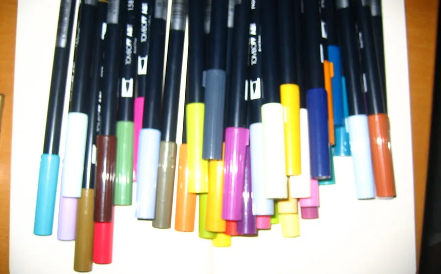
Brush pens
My favorite option for bold fills, heavier shadows, and quicker shape blocking.

Sketchbooks
Cheap-but-decent sketchbooks are easier to actually use than ones that feel too precious.
Some of these are affiliate links, which may support the site at no extra cost to you. The tiny restock stuff is here too if you need it: graphite lead and refill erasers.
Showing up mattered more than perfect pages
A 31-day drawing challenge is really a consistency project wearing an illustration costume. Some pages were exciting right away. Some were “well, that exists now,” which is also part of the record. The complete month matters because it shows the rhythm: the strong ideas, the awkward saves, the rushed mornings, and the drawings that only got good once the ink started solving problems.
Here is the full day-by-day recap: what each prompt became, what worked, what I would rethink, and what the month taught me about daily ink drawing.
The 31 Inktober drawings
1. Backpack: start with the stuff already around you

The first drawing was basically an inventory of the things that follow me around: AirPods, an Apple Watch, a travel camera, SD cards, pens, laptop, phone, and the usual tiny creative-life objects that somehow end up in every bag.
It was not my favorite finished page, but first drawings rarely need to be. Its job was to get me moving, make the challenge public, and break the seal on the sketchbook before I could overthink the whole month.
2. Discover: turn the prompt into a scene
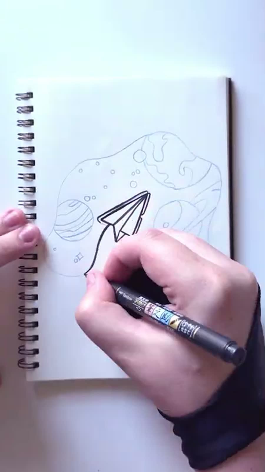
Discover became one of my favorites because it stopped being a noun and turned into a little story. A paper airplane drifting through planets had more room in it than drawing someone holding a magnifying glass.
This was also where stippling started doing real work. The background needed to feel dark without becoming a flat block of ink, so the dots let the page breathe while still giving the drawing that spacey, quiet feeling.
3. Boots: let nostalgia make the prompt specific
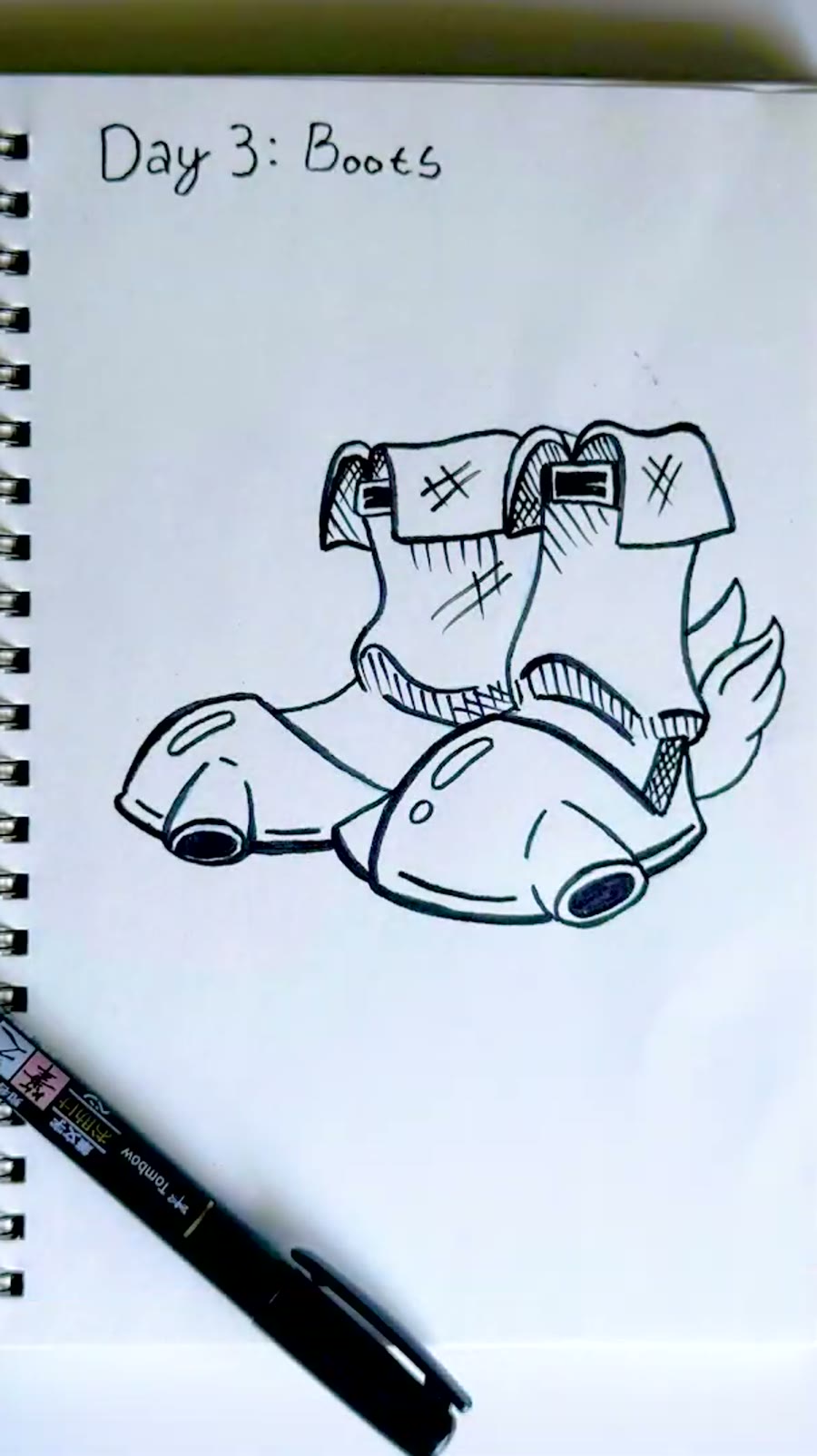
For Boots, I went straight to the Hover Boots from Ocarina of Time. They are one of those game items that felt impossibly cool as a kid, even if actually using them was kind of like trying to walk on a freshly waxed grocery store floor.
The useful part of a nostalgic object is that it already has design language built into it. I could focus on straps, mechanical details, and the little propulsion shapes instead of trying to invent the entire idea from nothing.
4. Exotic: combine ideas when the word is too broad

Exotic was hard because it is vague enough to become almost anything. I bounced between flowers, magic, a lamp, and decorative shapes before combining a few of those pieces into one object.
That ended up being the right move. When a prompt feels too open, combining two smaller ideas can give the drawing a clearer hook. The lamp handled the silhouette, and the flowers softened it so it felt more designed than random.
5. Binoculars: work with the ink mistake instead of restarting
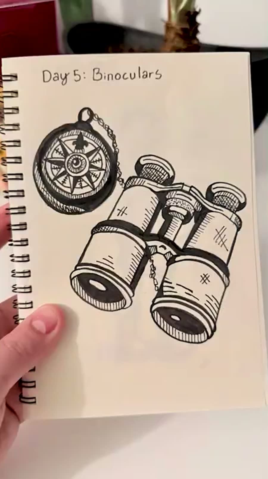
Binoculars was a good reminder that ink does not care about your plans. I messed up part of a circular form while inking, and instead of starting over I added a chain element to cover and integrate it.
That kind of save is not cheating; it is drawing. Inktober rewards the ability to keep moving. A fixed mistake can sometimes make the final piece feel more intentional than the clean version you planned.
6. Trek: make the journey belong to someone
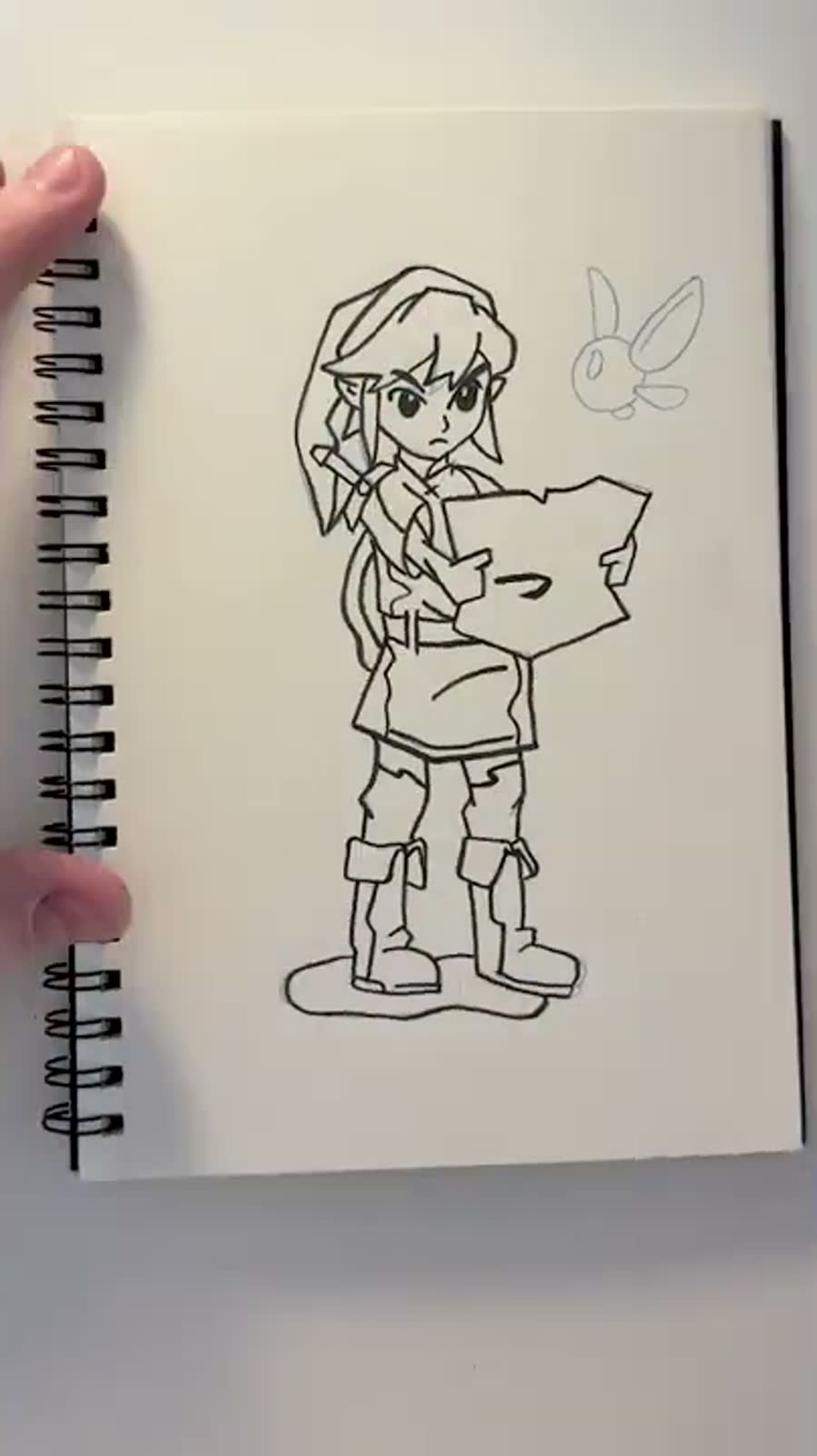
Trek became a Link-ish adventure drawing with a map and a tiny fairy companion. It is not a direct one-to-one version of one specific Link so much as the feeling of being sent out into a game world with a map and not enough information.
Adding a character gave the prompt an emotional entry point. The drawing was no longer only about movement; it was about someone deciding to go somewhere.
7. Passport: personal references beat generic travel symbols
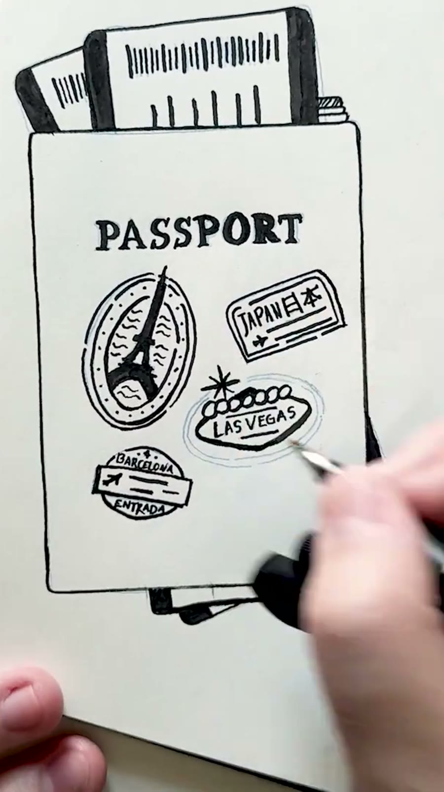
Passport was not one of my strongest pages, but it had a good personal angle. I used stamps from places I had actually been: Paris, Japan, Vegas, Barcelona, Tokyo, and a few travel memories that made the page less like a fake stock passport graphic.
The Vegas stamp was probably the most fun because the lights gave me something graphic to play with. Even when the full drawing is not a favorite, one small piece of it can still teach you what was worth keeping.
8. Hike: use the prompt as a doorway into a world

Hike pulled from the feeling of Pokemon Legends: Arceus: a mountain, a character looking out, and a little creature detail to make the world feel specific.
That is one of the best ways to keep a month-long challenge fresh. Let prompts open doors into things I already care about. The challenge stays structured, but the references keep it from feeling like homework.
9. Sun: contrast can make the joke work

Sun led to a mix of Mario Bros. 3 anxiety and a softer Yoshi sunset feeling. The angry sun is such a specific piece of game stress that pairing it with a quieter character moment made the drawing more interesting than a plain sun symbol.
Contrast helps a lot in these small drawings. If the object is loud, give it a quiet counterpoint. If the reference is familiar, change the mood so it feels like a new little scene.
10. Nomadic: character design can carry an abstract prompt

Nomadic became Kazuha from Genshin Impact because the idea of wandering is easier to feel through character design than through a generic travel icon. The hat, leaf detail, and quiet expression did a lot of the prompt work.
This was also one of the pages where controlled black fills and cross-hatching helped the character feel finished without needing full illustration detail.
11. Snacks: treat the object like a magical item
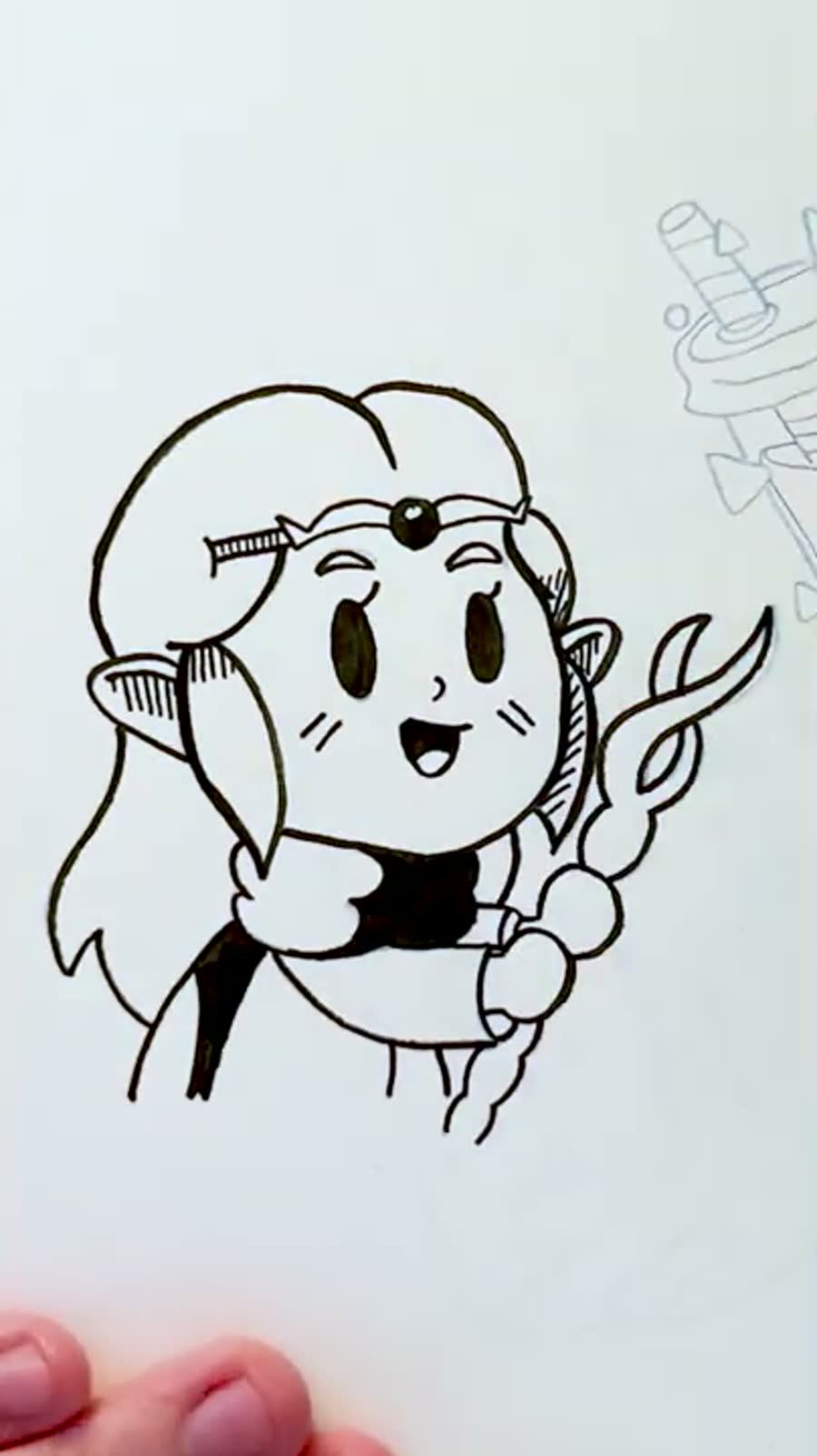
Snacks became a Zelda: Echoes of Wisdom inspired drink idea instead of a straightforward plate of food. I liked treating the snack like an item you could conjure or use, almost like a little game prop.
For small prompts, presentation matters. A snack drawing gets better when the object has a reason to exist visually: a container, label, spell effect, or tiny bit of worldbuilding.
12. Remote: changing the idea late can save it
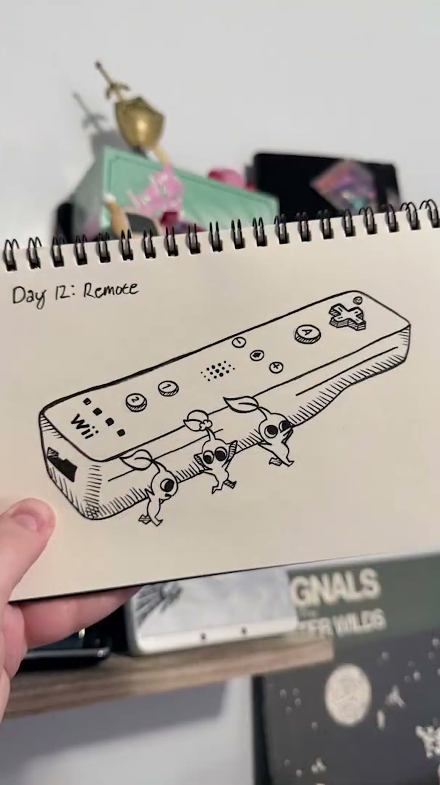
Remote started as a more direct Wii remote drawing, and I am very glad I changed it. Having Pikmin carry the remote gave the object scale, motion, and a reason to be there.
A late change is scary during a daily challenge because time is limited, but it is worth listening when the original concept feels flat. The new version did more work with the same prompt.
13. Horizon: stretch the prompt across the page
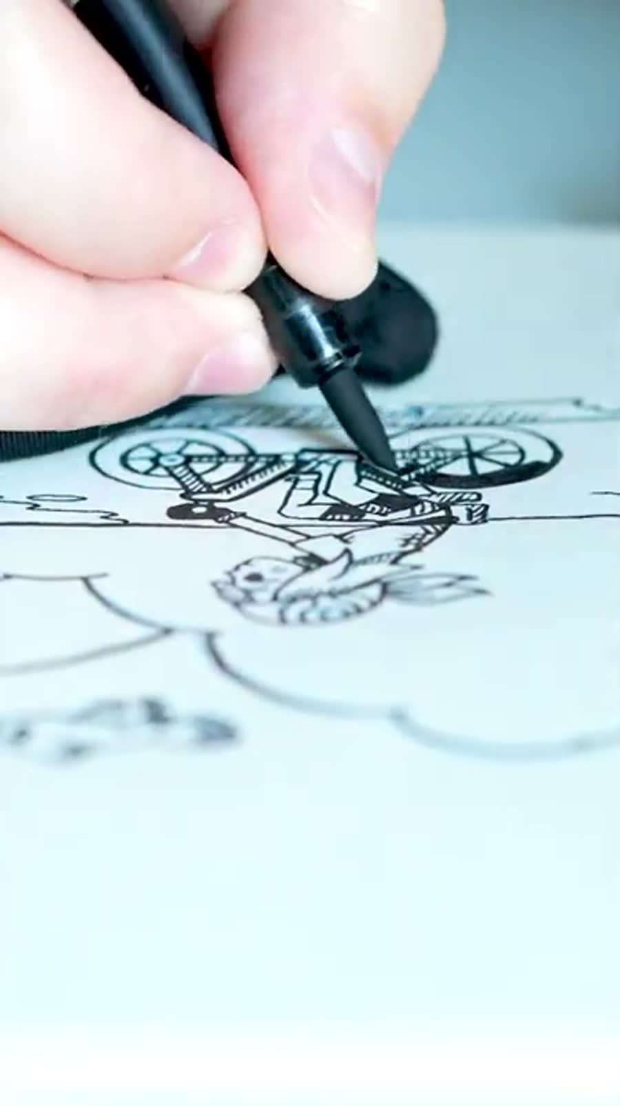
Horizon made me think of the Pokemon Emerald intro with May riding through an open route, water, clouds, and that clean travel feeling. It was a prompt about distance, so it needed more than a single object.
The composition mattered more than tiny detail here. Horizon is really a relationship between foreground, path, and distance. If those three things are clear, the viewer understands the prompt quickly.
14. Roam: movement can decide the composition
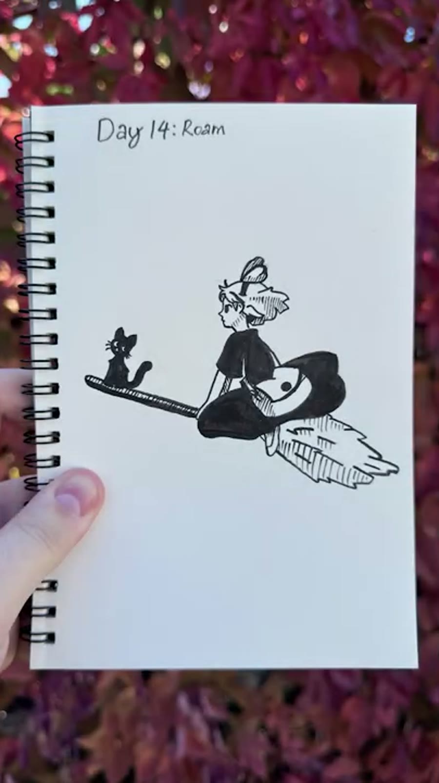
Roam turned into a Kiki’s Delivery Service drawing because flying is one of the cleanest ways to show movement across a page. The broom, character angle, and Jiji detail made the drawing feel like it was already traveling.
I also had to think carefully about negative space. A few bright areas needed to stay clean, so the ink planning mattered more than usual. White gel pen can help, but relying on the page itself usually looks better.
15. Guidebook: build a prop with clues, not filler

Guidebook became an alchemy-style object study with ingredients, plants, a torn book, quill, note, bottle, candle, and wax. It was one of those prompts where the little objects around the main object do a lot of the storytelling.
The useful lesson was restraint. A guidebook can become visually noisy fast, so I tried to add enough marks to imply information without making every inch of the page compete for attention.
16. Grungy: mood can carry a simple figure
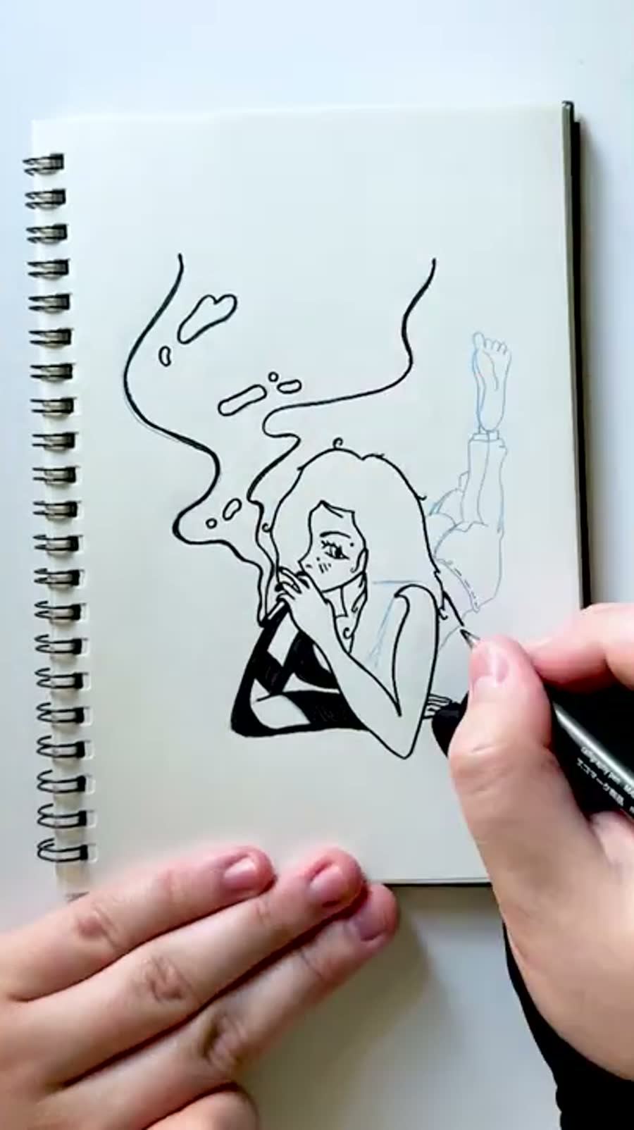
Grungy was mostly about attitude. A pose, heavier shapes, clothing choices, and a little bit of visual roughness can change how a character reads even when the drawing itself is simple.
It also reminded me that prompts come with cultural baggage. People bring their own read to a word like grungy, so the drawing has to choose a lane instead of trying to satisfy every possible version of the prompt.
17. Journal: make similar prompts feel different

Journal could have overlapped too much with Guidebook, so I pushed it toward Kingdom Hearts, memory, and Naminé instead. The notebook, heart, and Heartless references gave it a softer emotional angle.
When two prompts are close together, the answer is not always to avoid the similarity completely. Sometimes you just need the second drawing to have a different job.
18. Drive: familiar references still make you check the details
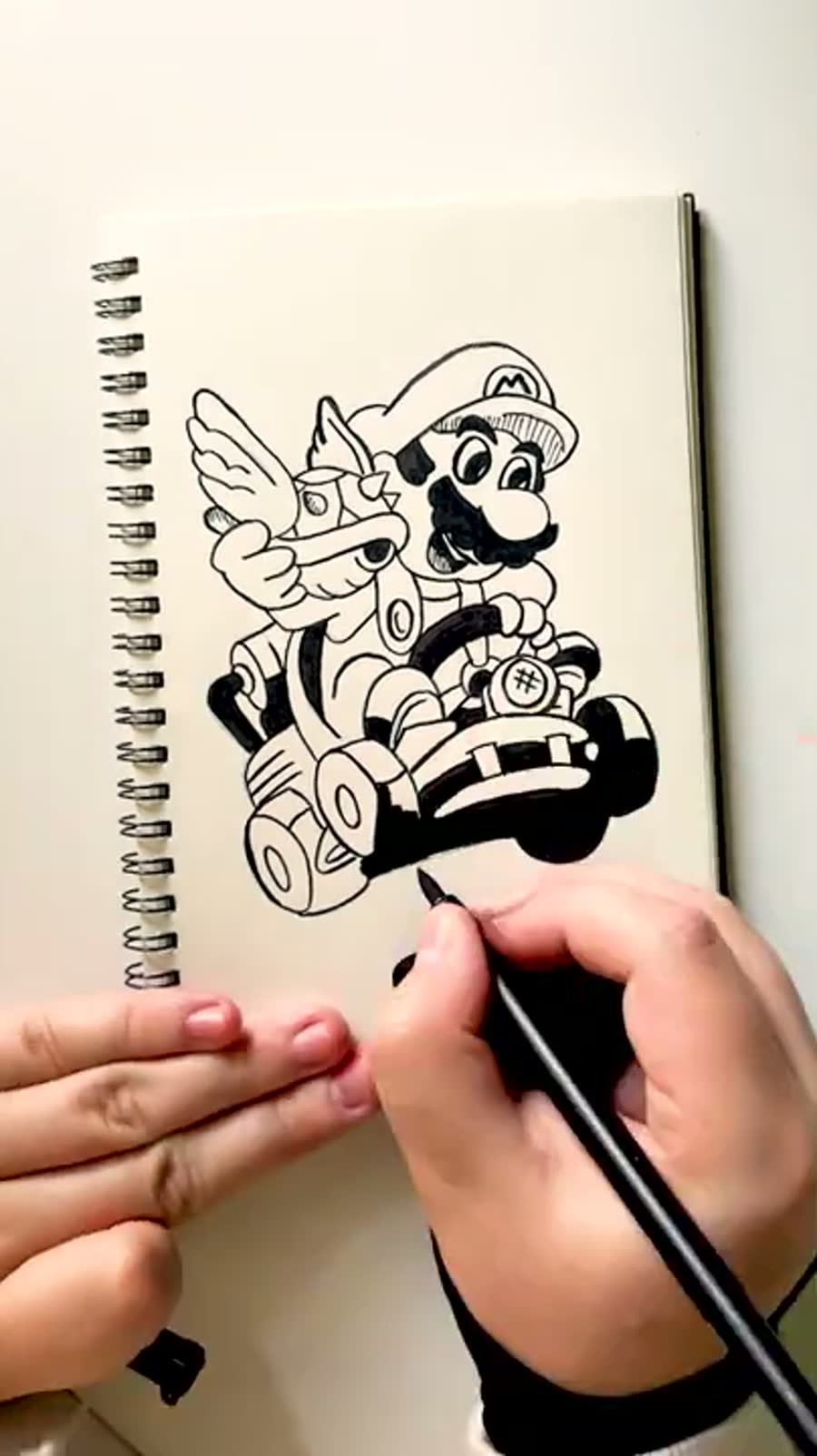
Drive became Mario Kart, specifically Mario holding a blue shell. I did later notice I had the item in the wrong hand, which is exactly the kind of thing that happens when memory and drawing collide.
That is part of why fan-art-adjacent prompts are useful practice. I think I know the object until the pen makes me prove it. The drawing still works, but the mistake is a good little note for next time.
19. Ridge: a weak sketch can still become a good ink drawing

Ridge was inspired by Sharpedo Bluff from Pokemon Mystery Dungeon: Explorers. It is not the most literal ridge idea, but it has the feeling of a distinct place carved into the landscape.
The pencil sketch did not look promising. The ink pass changed that. Texture, shadows, and stronger black shapes can pull a hesitant sketch together in a way that makes you glad you did not give up on it too early.
20. Uncharted: maps and symbols can do the storytelling

Uncharted could have gone straight toward the video game series, but a Wind Waker treasure-chart idea felt more fun. The anchor, pirate symbol, and map language made the prompt feel like an adventure object.
For exploration prompts, design language matters. Maps, symbols, arrows, islands, tools, and weathered edges all tell the viewer what kind of journey they are looking at.
21. Rhinoceros: let a specific character soften an awkward prompt

Rhinoceros became Merengue from Animal Crossing, which immediately made the prompt easier to love. I put her in a bakery setting partly because it suited the character and partly because I had bakery energy already floating around from the Kiki drawing.
The trick was keeping the setting light enough to support her instead of making the whole page about shelves and furniture. Backgrounds are useful until they start auditioning for the main role.
22. Camp: atmosphere can be built with texture

I accidentally kept thinking of the prompt as Campfire, which pushed the drawing toward an Over the Garden Wall inspired scene. That gave it mood, story, and a reason for the dark texture.
Stippling carried the background here. It gave the forest a night-time feeling without requiring a fully rendered environment behind the characters.
23. Rust: pick a reference that already has the feeling

Rust was one of my favorites because the broken Master Sword from Tears of the Kingdom already has decay, damage, history, and magic baked into it.
The green magic shapes and Silent Princess flowers helped balance the broken metal with something delicate. That contrast made the page feel like more than a sword study.
24. Expedition: dense drawings need hierarchy
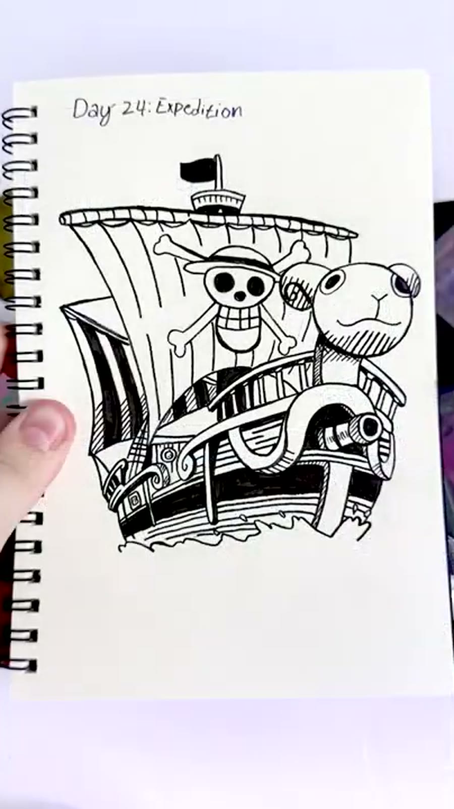
Expedition became the Going Merry from One Piece. I did get corrected on the name in the process, which is fair. The important thing is that a ship naturally carries the idea of a long journey.
Dense drawings like this need hierarchy. The large shapes have to read first, then the tiny marks can reward people who look longer. Without that structure, detail turns into visual static.
25. Scarecrow: choose the less obvious reference when it keeps things fresh

Scarecrow could have easily become another Zelda drawing, but I went with Turnip Head from Howl’s Moving Castle instead. It kept the month from leaning too hard on the same reference pool.
The cross-hatching was fun here because the character shape is clear enough to hold texture. When the silhouette reads, you can get a little more playful inside it.
26. Camera: detailed characters force cleaner ink decisions
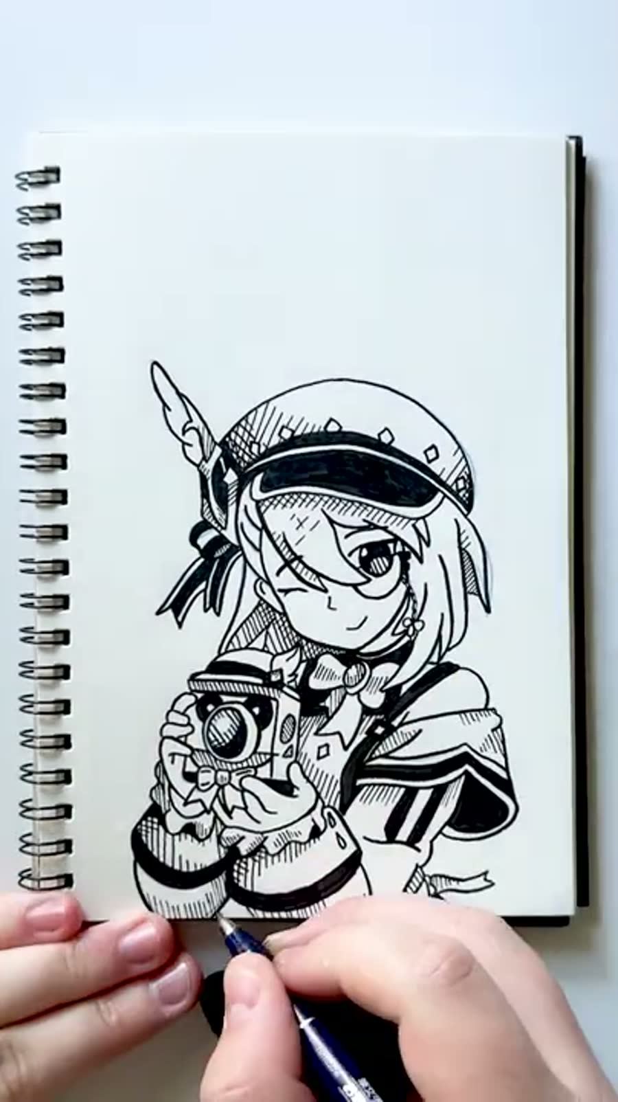
Camera became Charlotte from Genshin Impact after a friend suggested it. This was one of the entries where I liked how the hatching handled the clothes, eyes, hair, and little prop details.
Detailed characters are risky in a daily challenge because every small shape adds time. This one reminded me to decide what actually needs precision before the ink stage traps me into rendering everything.
27. Road: scale the composition before the details take over

Road became Castle Oblivion from Kingdom Hearts, and this is one of the drawings I would compose differently now. I liked the idea, but the portrait orientation and small scale made the structure feel tighter than it needed to be.
That is the lesson here: detail can make a drawing satisfying, but it does not always solve the prompt. Composition has to answer the idea before texture and line work decorate it.
28. Jumbo: sometimes the tool really is the problem

Jumbo became Kirby, which is a pretty perfect prompt match. More importantly, this was around the point where I realized my pens had been making the challenge harder than it needed to be.
Fresh ink changed everything. If a tool is fighting you for days in a row, the problem may not be your patience. Sometimes the pen is simply done.
29. Navigator: emotional references do not have to be loud

Navigator pulled from Outer Wilds, specifically Riebeck and the banjo. That game has a very specific emotional temperature, and I wanted the drawing to point toward that feeling without spoiling anything.
Not every prompt needs to be explained by an obvious object. Sometimes the drawing works because it points toward a feeling the viewer can recognize, even if the reference is personal.
30. Violin: the near-finish-line drawings still count
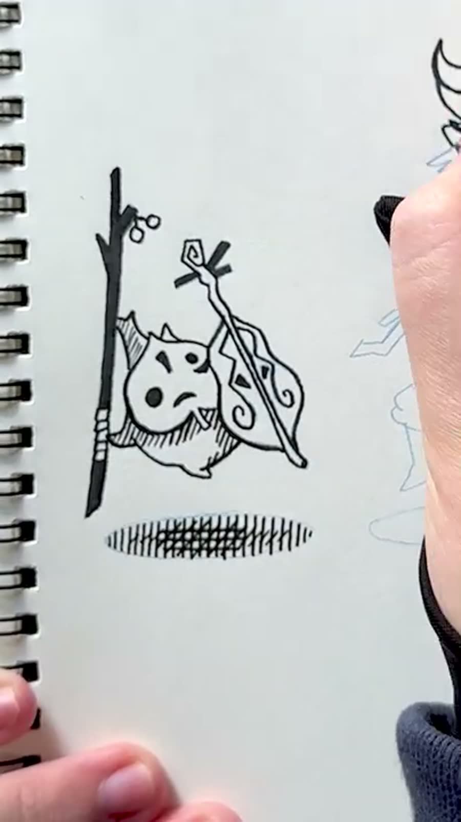
Violin became Makar and Fado from Wind Waker. At this point in the month, the challenge becomes less about making every drawing brilliant and more about keeping the promise you made to the sketchbook.
I might handle some of the shadows differently now, maybe with stronger solid shapes instead of the marks I chose. Still, it belongs in the set. The uneven drawings are part of why the full month is useful to look back on.
31. Landmark: finish with the clearest version you can make that morning
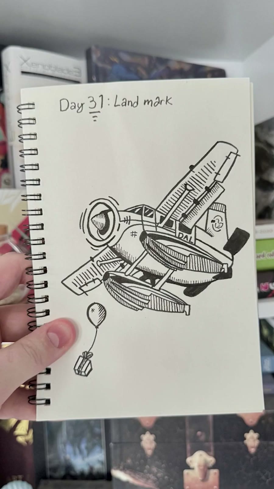
Landmark landed on Halloween morning, so the practical goal was to finish. I originally thought about drawing the Animal Crossing airport, but the Dodo Airlines plane and balloon were the cleaner choice for the time I had.
That is not a failure. A deadline can strip the idea down to what the drawing actually needs: a recognizable subject, clean ink, and enough care to make the final page feel like an ending instead of a collapse.
The best prompts became small stories
My favorite drawings usually happened when I stopped treating the prompt like a vocabulary test. Discover became a paper airplane in space. Remote became Pikmin carrying a Wii remote. Rust became the broken Master Sword surrounded by magic and flowers.
That is the part I want to keep using after Inktober: prompts work better when they become a situation. A prop, a character, a place, or a small joke gives the drawing a reason to exist beyond checking off the word.
Recording the process added pressure
Filming every drawing made the final recap video possible, and it made the project easier to share. It also made every day take longer. The drawing was no longer just a drawing; it was footage, editing, storage, timing, and proof that the month happened.
I am glad I did it, but I would plan for that extra load more honestly next time. A documented challenge needs more buffer than a private sketchbook challenge because the process becomes part of the work.
Drawing every day taught me how I work
By the end, I was exhausted, but the complete set mattered. The month taught me what kinds of prompts spark ideas quickly, which tools I trust, how much time a daily ink drawing actually takes, and how useful it is to finish imperfect work in public.
The best reason to do Inktober is not to make 31 perfect drawings. It is to learn what your creative rhythm looks like once the novelty wears off and the habit has to carry the rest.
Inktober drawing challenge questions
01
Is Inktober worth doing if I cannot draw every day?
Yes. Daily drawing teaches momentum, but a modified version is still useful if it helps you make more work than you would have made otherwise. The challenge should create structure, not punishment.
02
What tools did you use for Inktober?
I used a small sketchbook, a mechanical pencil with blue lead for loose planning, brush pens for bold fills, and a finer ink pen for controlled outlines, hatching, and details.
03
How do you avoid burnout during a 31-day drawing challenge?
Keep the setup simple, decide on ideas quickly, let some drawings be smaller, replace tools that are fighting you, and remember that the goal is the finished month, not a perfect page every day.
04
Should every Inktober drawing be portfolio-ready?
No. Some drawings will be studies, jokes, experiments, or survival drawings. The value is in the full body of work and what it teaches you about taste, speed, consistency, and problem solving.