
Quick overview
How to blend text into paper texture
- Start with a real paper texture so the type has a surface to inherit.
- Roughen the edge with a very small Turbulent Displace amount.
- Use the paper layer as a Displacement Map source.
- Match the grain with HLS Noise, then animate it only if the shot needs motion.
- After Effects texture settings to keep nearby.
1. Start with the paper, not the type
The paper texture is doing most of the visual work in this effect. Before adding any effects, place the texture in the composition, scale it to the framing you actually want, and then set the type directly on top of it. The first thing to judge is not the effect stack. It is whether the type feels like it belongs to the same world as the surface.
Digital text usually gives itself away in two places: the edge of the letterform and the fill inside the letter. The outline is too mathematically perfect, and the inside of the letter is too flat compared with the grain around it. This workflow fixes both problems by letting the paper influence the type instead of treating the paper as a decorative background.
A serif face, hand-drawn lettering, or display type with a little personality will usually show the effect more clearly than a thin geometric font. That said, the same approach can work on almost any lettering if the values stay subtle enough for the word to remain readable.
2. Roughen the letter edge with Turbulent Displace
Turbulent Displace is the first effect because it breaks the perfect vector edge. When it is first applied, it can look like the letters are melting or wobbling. For a printed paper look, pull it way back. In the video, the amount is lowered to 2, which is enough to interrupt the edge without making the text hard to read.
The effect should be felt more than noticed. If someone can immediately identify the distortion, it is probably too strong. Toggle the effect on and off while zoomed in. You are looking for a tiny ink-bleed or paper-absorption quality, not a wavy title treatment.
This step is especially useful when the paper texture has rough fibers, speckling, handmade grain, or scanned imperfections. Clean text edges fight against those details. A small amount of turbulence lets the type soften into them.

3. Let the paper texture displace the type
The Displacement Map is the step that makes the lettering feel connected to the actual surface. Instead of applying random distortion, set the displacement source to the paper texture layer. Now the light and dark information in the paper can push the text in a way that matches the surface below it.
Keep this restrained. A strong displacement map can make letters shimmer, warp, or become illegible. The goal is to let the type follow the tiny bumps, fibers, and value changes in the paper while still reading as type. This is the difference between text that sits on top of a texture and text that feels like it was printed into it.
If the paper layer has large contrast swings, you may need to reduce the displacement or pre-process the texture. A smoother texture layer can make a better displacement source than a dramatic final background.
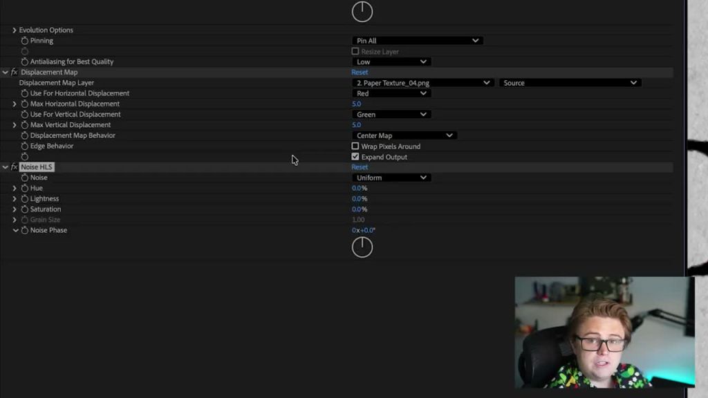
4. Match the grain inside the letters with HLS Noise
Once the edge and displacement are working, look at the fill of the letters. A perfectly flat black fill will still feel digital if the surrounding paper is noisy. Add HLS Noise and keep it uniform so the type gains a similar grain structure without adding unwanted color.
In most paper-printing looks, the lightness channel is the useful part. You can leave hue and saturation alone unless the texture itself has color noise that needs to be matched. The noise should sit at the same visual scale as the paper grain. If the noise is too large, it looks like an effect. If it is too small, it may disappear once the video is compressed.
This is also a good moment to soften the type color. Pure black often feels too digital on scanned or photographed paper. A slightly lifted dark gray can feel more like ink absorbed into a textured surface.
5. Add animated grain and choppy movement only after the still frame works
If the design is a still frame, stop once the text feels printed. If it is part of a motion piece, you can animate the texture in ways that feel connected to analog video, imperfect ink, or handmade motion.
For subtle moving grain, animate the Noise Phase with an expression like time * 100. Lower the number for slower movement, raise it for more active grain. This works especially well if you want the text to feel recorded, scanned, or transferred rather than perfectly static.
For the Turbulent Displace movement, smoother is not always better. A perfectly fluid wiggle can feel uncanny for a rough printed texture. Adding Posterize Time at around 6 fps gives the motion a choppier, handmade rhythm that fits the printed-paper look better than a silky animation.

Here’s the numbers
After Effects printed text settings to keep nearby
Use these as starting points, then adjust them to match the paper texture, font weight, and size of the type in your composition.
2 for a subtle roughened edge instead of an obvious wave.Uniform noise and mostly adjust Lightness so the type grain matches the paper.time * 100 on Noise Phase and adjust the number for speed.6 fps on the text layer when animated distortion feels too smooth.Common mistakes that make textured type look fake
- Too much displacement: the paper should influence the text, not melt it.
- Perfectly clean edges: sharp vector edges fight against rough paper grain.
- Mismatched noise scale: the grain inside the letters should feel related to the background.
- Pure black text: slightly lighter ink often sits more naturally on real paper.
- Animating before the still frame works: motion will not fix a texture blend that already feels pasted on.
The video above shows the exact effect order. Use the written version here as the scannable checklist when you are building your own textured type treatment in After Effects.
After Effects Text Texture Questions
01Can this technique work on fabric, concrete, or walls?
Yes. The same logic works on most surfaces: roughen the type edge, use the surface as displacement, and match the grain or noise inside the letters.
02Which effect matters most for printed text?
The Displacement Map usually does the most convincing blending because it lets the texture shape the text. Turbulent Displace and HLS Noise support that by fixing the edge and fill.
03Should the texture be animated?
Only if the project needs motion. For a still print-style frame, a believable static blend is enough. For motion work, animate subtly so the texture does not feel detached from the text.
04Can I save this as an After Effects preset?
Yes. Select the texture effects on the text layer, go to Animation, and save them as an Animation Preset. That makes the printed text treatment much easier to reuse on future type layers.